Branding · Pattern Design · Print on Demand
Niwa
庭
Online shop
Discipline. Medium
Brand · Pattern · Shop. iPad · Print on Demand
Role
Solo — everything

庭 • Garden • Bloom
-
Overview
NIWA began as a personal illustration project inspired by flowers I see everyday in my neighborhood. What started as hand-drawn artwork on iPad gradually evolved into a complete visual identity and print-on-demand brand.
The goal was to transform original illustrations into a cohesive collection of patterns, products, and brand assets while maintaining a soft, feminine, and artistic aesthetic. Every element—from the logo to the final products—was designed to feel intentional, delicate, and connected.
Problem
Many print-on-demand brands rely on placing artwork onto products without creating a strong visual identity. As a result, the products may feel disconnected, making it difficult for customers to recognize or remember the brand.
For NIWA, the challenge was to build a recognizable brand system where illustrations, patterns, colors, logo, and products all worked together as one consistent experience rather than a collection of unrelated designs.
GOal
Create a complete lifestyle brand built around original hand-drawn illustrations and pattern design.
The project aimed to develop a cohesive visual language that could be applied consistently across multiple touchpoints, including branding, packaging, e-commerce, and print-on-demand products. By combining illustration, pattern design, and brand strategy, NIWA sought to create products that feel personal, artistic, and emotionally engaging.
2. Creative direction
The visual direction of NIWA is inspired by gardens, flowers, butterflies, passion fruits and soft nostalgic colors.
Brand Keywords
Soft
Feminine
Organic
Dreamy
Handmade
Nature-Inspired
3. Pattern design
Moodboard

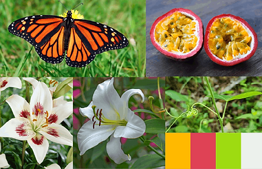
*Some photos were taken in my neighborhood; others were taken from Google.
*The final color palette selected for the brand differs from this one.
Hand-drawn Illustration on Ipad
-
Main Pattern

*The illustration was drawn in Procreate using an Apple Pencil. Each element was drawn separately on a different layer.
⮕
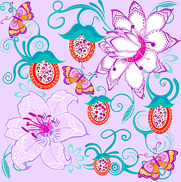
*Main illustration
⮕

*A seamless pattern was created from the main illustration in Photoshop.
The main pattern was created from hand-drawn floral and botanical elements.
Each illustration is designated to work as part of a repeat pattern, making it suitable for fabric, accessories, stationnery and lifestyle products.
The pattern system includes both detailed florale compositions and complementary patterns to create variety accross the collection.
-
Complementary Patterns

⮕

⮕


⮕

⮕


⮕
⮕

*All complementary patterns were drawn in Procreate using an Apple Pencil, then assembled into a seamless pattern in Photoshop.
5. Color palette
Lilac
Blush
Iris
Violet
Teal
Petal
Tangerine
Mist
I didn't start NIWA with a predefined color palette. I wanted to draw freely and focus on creating illustrations that felt beautiful to me without being restricted by branding rules.
After completing the illustrations, I extracted colors directly from the artwork and built the brand palette around them. This process helped create a stronger connection between the illustrations, logo, patterns, and final products.
The combination of lilacs, violets, pinks, teals, and warm oranges gives NIWA a distinctive personality. While the palette feels soft and feminine, it is also colorful, playful, and a little unexpected—reflecting the whimsical and imaginative world I wanted the brand to embody.
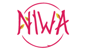
4. Logo design

The NIWA logo combines elegant serif typography with hand-drawn floral details.
The customized letters reflect the organic feel of the brand, while the flower accent adds a soft and recognizable visual signature.
The result is a delicate and distinctive identity inspired by nature and illustration.
1. Unselected logos

2. Typography exploration

⮕

4. Floral details


*Floral inspiration

*Bamboo inspiration
+

=

5. Color exploration

⮕

⮕

6. Final logo and usage

*Final logo

*Favicon
%20(1)%20(1).png)
*Logo usage on product labels

*Favicon usage on SNS
5. Product application


DRAWING
-
Procreate
Used for hand-drawn illustration and pattern elements.
PATTERN & EDITING
-
Photoshop
Used for pattern editing and color adjustments.
PRODUCTION & FULFILMENT
-
Printful
Used to create print-on-demand product previews and test product application.
6. TOOLS
7. What this project shows
NIWA shows my ability to create a complete visual brand from illustration to product application. Through this project, I developped hand-drawn patterns, built a soft brand identity, and applied the artwork across multiple print-on-demand products in a consistent and cohesive way.
Niwa